Brand
The MiMon logo, its colours and its typeface, and how to use them. If you need to mention MiMon in credits, on a poster or in a news story, here is what you need.
The logo

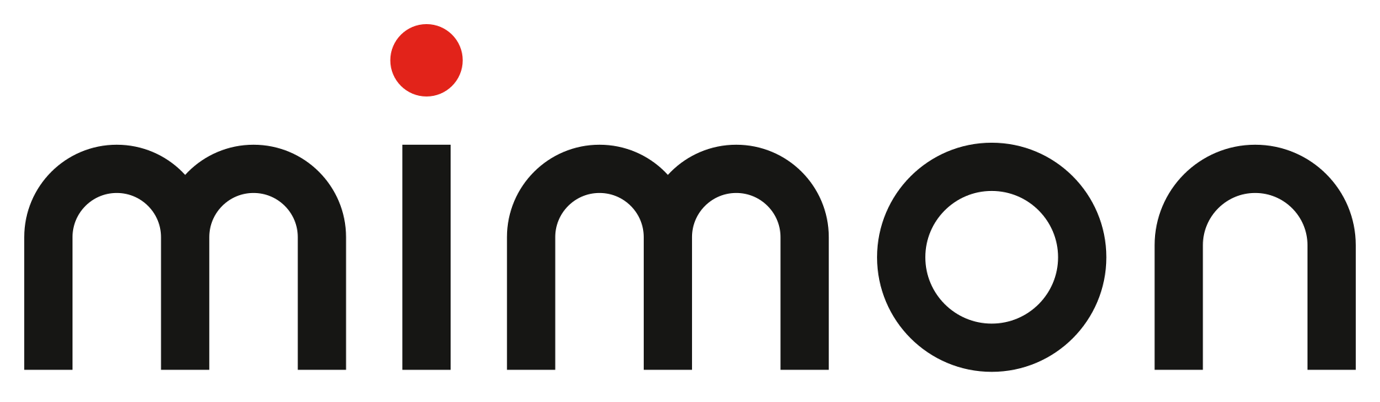
It is two m’s with an i between them. The m’s are Pep Payo’s parents, who ran the MiMon perfume shop; the i is him. The dot on the i is red, like the light that comes on when a camera is recording.
It is a custom drawing, made of a single line and geometric shapes. It doesn’t come from any typeface.
We tell the story in “Two m’s and a red dot: we have a logo” and in “Why a production company has a perfume shop’s name”.
Versions and downloads
There are two pieces: the full logotype and the “mi” symbol, for when there is no room (avatars, icons and anything less than 60 px wide). Each has five versions, depending on the background it sits on. The PNGs have a transparent background.
Download all the logos (a ZIP with all the SVGs and PNGs and the usage rules) ZIP · 277 KB
Logotype




Symbol


How to use it
- Clear space. Around the logo, at least the height of the m, with no text or any other element.
- Minimum size. The logotype, 60 px wide on screen or 15 mm in print. The symbol, 16 px.
- Over an image or a video. The light version with the red dot, in a dark, quiet area.
- Always these files. Don’t redraw it or type “mimon” in a typeface to imitate it.
How not to
The logo is not to be altered. Four examples of what not to do:
Colours
Paper, ink and a single red. The red is the recording light: it appears on the dot of the logo and on just one other thing per piece. If it were everywhere, it would stop meaning “here”.
We never use pure white or pure black.
| Colour | HEX | RGB | Use |
|---|---|---|---|
| Stone | #DEDBD3 | 222 219 211 | Surfaces, boxes and info panels |
| Paper | #F3F2EE | 243 242 238 | The background of everything |
| Grey | #6E6B65 | 110 107 101 | Secondary text and captions |
| Ink | #161614 | 22 22 20 | Text, logo and dark backgrounds |
| REC red | #E2231A | 226 35 26 | The dot of the logo and just one other thing per piece |
| Off-white | #EDEBE6 | 237 235 230 | Text and logo on dark or on red |
Typeface
One typeface for everything: Inter (opens in a new tab), which is open source. Headings are set in weights 500 and 600, and body text in 400.
We live it, we tell it.
For press and collaborators
MiMon Produccions is a video production company in Barcelona. It makes video for non-profits, institutions and businesses, making-of films for production companies and its own documentaries.
The name is written MiMon, as one word with two capitals. In credits and directories, “MiMon Produccions”.
If you need another size or format, or have any questions, write to us.
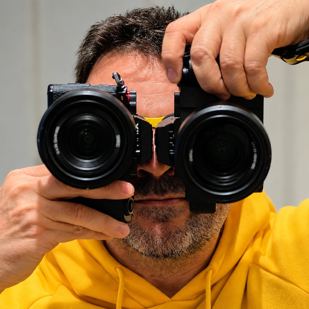
Photos of Pep Payo
Photos of the founder of MiMon Produccions, to download. They may be used under the conditions below.


Conditions of use for the photos
- Free of charge and without asking permission to write or talk about MiMon or Pep Payo: news stories, interviews, credits, festival programmes and directories.
- Credit required: “Pep Payo / MiMon Produccions”.
- They may not be altered, other than cropping or resizing.
- For any other use, such as advertising other products or services, you need to ask first.
- The rights belong to Pep Payo (MiMon Produccions). All rights reserved.